Several days ago, Dflying Chen just shown us how to implement in-place editing functionality using ASP.NET Atlas framework, and the custom control he writes called InPlaceEditingInput is pretty cool indeed. In this post, I will show you how to achieve the same thing in WPF, and also demonstrate how the WPF makes our lives as programming hobbyists much easier:)
WPF introduces a new concept called Control template, which means that you can replace the visual tree of any WPF element by defining a new ControlTemplate for the targeting element, and this capability makes writing a custom In-Place Editing WPF control much easier. the following code lists the ControlTemplate I define for the custom textbox control called InfoTextBox:
The above XAML markup is really worth a detailed explanation, WPF actually supports styling, so what's styling? well, you can think of WPF styling as the CSS for XHTML elments, with styling, you can easily change the look and feel of the WPF controls by grouping the style properties of a speficied control in a common location(usually in the ResourceDictionary collection). Another thing you might note is that I define a lot of triggers inside the style element, so what's triggers? a trigger represents a specific condition for a property value, when a trigger condition is met, it wil cause the associated setter XAML statement to change a control property's value, in the above XAML markup for instance, when the "HasText" property is set to true, it will change the "Message" Label element's Visibility property to "Hidden".
As I mentioned earlier in this post, InfoTextBox is a custom control which is derived from System.Windows.Controls.TextBox, the actual implementation of this custom control is nothing more than adding two additional dependency properties for the base TextBox control, one is TextBoxInfoProperty, and the other is HasTextProperty as the following code demonstrates:
 InfoTextBox Implementation
After all those plumbing work completes, we can use the tailer-made control anywhere as we would like:
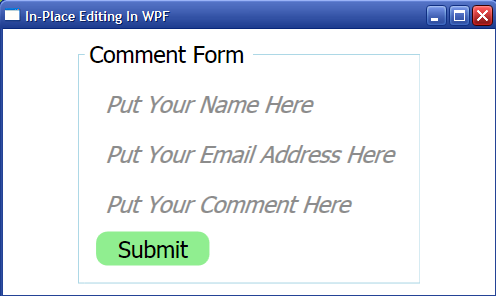
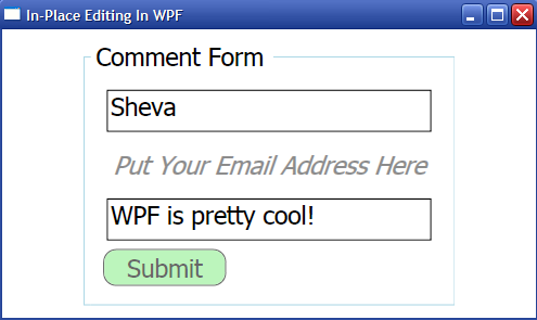
Here is the screenshot of my functionally complete in-place editing UI:
For complete source code, please check here.
WPF introduces a new concept called Control template, which means that you can replace the visual tree of any WPF element by defining a new ControlTemplate for the targeting element, and this capability makes writing a custom In-Place Editing WPF control much easier. the following code lists the ControlTemplate I define for the custom textbox control called InfoTextBox:
<Style TargetType="{x:Type itb:InfoTextBox}">
<Setter Property="FontSize" Value="20"/>
<Setter Property="Margin" Value="5"/>
<Setter Property="BorderBrush" Value="Black"/>
<Setter Property="BorderThickness" Value="1"/>
<Setter Property="Template">
<Setter.Value>
<ControlTemplate TargetType="{x:Type itb:InfoTextBox}">
<Grid Margin="0">
<Border Name="background"
Background="{TemplateBinding Background}"
BorderBrush="{TemplateBinding BorderBrush}"
BorderThickness="{TemplateBinding BorderThickness}">
<Decorator x:Name="PART_ContentHost" VerticalAlignment="Top" Margin="0"/>
</Border>
<Label Content="{TemplateBinding TextBoxInfo}"
x:Name="Message"
Foreground="Gray"
Opacity="0.9"
FontSize="{TemplateBinding FontSize}"
FontStyle="Italic"
HorizontalAlignment="Left"
VerticalAlignment="Top"
Margin="0"/>
</Grid>
<ControlTemplate.Triggers>
<MultiTrigger>
<MultiTrigger.Conditions>
<Condition Property="HasText" Value="False"/>
<Condition Property="IsFocused" Value="True"/>
</MultiTrigger.Conditions>
<MultiTrigger.EnterActions>
<BeginStoryboard Storyboard="{StaticResource enterGotFocus}"/>
</MultiTrigger.EnterActions>
<MultiTrigger.ExitActions>
<BeginStoryboard Storyboard="{StaticResource exitGotFocus}"/>
</MultiTrigger.ExitActions>
</MultiTrigger>
<MultiTrigger>
<MultiTrigger.Conditions>
<Condition Property="HasText" Value="False"/>
<Condition Property="IsFocused" Value="False"/>
</MultiTrigger.Conditions>
<Setter TargetName="background" Property="Visibility" Value="Hidden"/>
</MultiTrigger>
<Trigger Property="HasText" Value="True">
<Setter TargetName="Message" Property="Visibility" Value="Hidden"/>
</Trigger>
<Trigger Property="IsEnabled"
Value="false">
<Setter TargetName="background"
Property="Background"
Value="{DynamicResource {x:Static SystemColors.ControlBrushKey}}"/>
<Setter Property="Foreground"
Value="{DynamicResource {x:Static SystemColors.GrayTextBrushKey}}"/>
</Trigger>
<Trigger Property="Width"
Value="Auto">
<Setter Property="MinWidth"
Value="100"/>
</Trigger>
<Trigger Property="Height"
Value="Auto">
<Setter Property="MinHeight"
Value="20"/>
</Trigger>
</ControlTemplate.Triggers>
</ControlTemplate>
</Setter.Value>
</Setter>
</Style>
The above XAML markup is really worth a detailed explanation, WPF actually supports styling, so what's styling? well, you can think of WPF styling as the CSS for XHTML elments, with styling, you can easily change the look and feel of the WPF controls by grouping the style properties of a speficied control in a common location(usually in the ResourceDictionary collection). Another thing you might note is that I define a lot of triggers inside the style element, so what's triggers? a trigger represents a specific condition for a property value, when a trigger condition is met, it wil cause the associated setter XAML statement to change a control property's value, in the above XAML markup for instance, when the "HasText" property is set to true, it will change the "Message" Label element's Visibility property to "Hidden".
As I mentioned earlier in this post, InfoTextBox is a custom control which is derived from System.Windows.Controls.TextBox, the actual implementation of this custom control is nothing more than adding two additional dependency properties for the base TextBox control, one is TextBoxInfoProperty, and the other is HasTextProperty as the following code demonstrates:
InfoTextBox Implementation
After all those plumbing work completes, we can use the tailer-made control anywhere as we would like:
<GroupBox Header="Comment Form" FontSize="20" Margin="10" BorderBrush="LightBlue" BorderThickness="1" Padding="10">
<Grid Margin="0">
<Grid.RowDefinitions>
<RowDefinition/>
<RowDefinition/>
<RowDefinition/>
<RowDefinition/>
</Grid.RowDefinitions>
<Grid.ColumnDefinitions>
<ColumnDefinition Width="Auto"/>
</Grid.ColumnDefinitions>
<itb:InfoTextBox TextBoxInfo="Put Your Name Here" TextWrapping="NoWrap" Grid.Row="0" Grid.Column="0"/>
<itb:InfoTextBox TextBoxInfo="Put Your Email Address Here" TextWrapping="NoWrap" Grid.Row="1" Grid.Column="0"/>
<itb:InfoTextBox TextBoxInfo="Put Your Comment Here" TextWrapping="NoWrap" Grid.Row="2" Grid.Column="0"/>
<Button Content="Submit" Grid.Row="3" Grid.Column="0" Width="100" Height="30" HorizontalAlignment="Left"/>
</Grid>
</GroupBox>
Here is the screenshot of my functionally complete in-place editing UI:
For complete source code, please check here.